.svg)

The Importance of Color Psychology in Branding and Marketing
How brands can use color psychology to influence emotions, shape perceptions, and guide consumer behavior. From red's urgency to blue’s trust, understanding color associations helps freelancers and brands boost recognition, drive action, and build loyalty. It also covers best practices for building a consistent color palette, marketing with intention, and avoiding cultural or accessibility mistakes.
Colors are powerful elements in design and marketing that evoke emotions, influence perceptions, and drive behavior. For brands, understanding color psychology can be a valuable tool for creating a lasting impression and connecting with consumers on a deeper level. The right color choices can increase brand recognition, build trust, and even affect buying decisions.
In this article, we’ll explore the role of color psychology in branding, how different colors impact consumer behavior, and how to effectively use this knowledge to strengthen your brand and marketing efforts.
1. The Basics of Color Psychology
Color psychology is the study of how colors influence human emotions and behavior. Each color can evoke specific responses, which can vary based on cultural associations, personal experiences, and even context. For marketers and designers, understanding these associations helps create designs that evoke desired emotions and actions.
- Emotional Response: Colors like red, blue, and green can elicit specific emotional responses, such as excitement, calmness, or trust.
- Perceived Brand Personality: Colors can give consumers insights into a brand's personality. For example, a brand that uses bold, bright colors may be seen as energetic and youthful, while a brand with muted tones might be perceived as sophisticated and reliable.
- Influence on Decision Making: Color can also impact buying behavior. Research shows that color can increase brand recognition by up to 80%, which can significantly affect purchasing decisions.
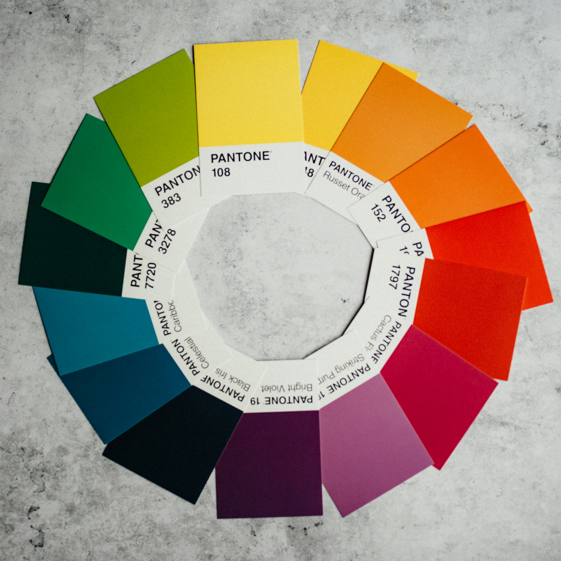
2. Color Associations and Their Impact on Consumer Behavior
Different colors are associated with various emotions and qualities, making them useful for conveying brand identity and influencing consumer perception.
Red Energy and Urgency
Red is a stimulating color that evokes excitement, passion, and urgency. It’s often used to encourage action, making it popular for “Buy Now” buttons and sale notifications. Brands in fast-paced industries, such as food and retail, frequently use red to capture attention and create a sense of urgency.
Blue – Trust and Reliability
Blue conveys trust, calmness, and professionalism. It’s widely used by tech, finance, and healthcare companies to communicate reliability and stability. Studies suggest that blue has a calming effect, making it suitable for brands that want to establish a sense of security and dependability.
Green – Growth and Health
Green is associated with nature, growth, and health. It’s often used by eco-friendly brands and companies in the wellness and organic food industries. Green can also imply freshness and peace, making it a great choice for brands that promote sustainability and well-being.
Yellow – Optimism and Warmth
Yellow evokes feelings of happiness, optimism, and warmth. It’s an attention-grabbing color that works well for brands with a playful or friendly personality. However, too much yellow can cause anxiety, so it’s best used sparingly to highlight key elements and convey a sense of positivity.
Black – Sophistication and Luxury
Black represents power, sophistication, and elegance. High-end brands often use black to create an air of exclusivity and luxury. It’s a versatile color that can also add contrast and drama to a design, enhancing the perceived quality of products.
3. Choosing Colors for Your Brand
Selecting colors for a brand goes beyond personal preference. Consider how colors align with your brand’s mission, values, and target audience to create a cohesive and meaningful visual identity.
1. Define Your Brand Personality
Identify your brand’s core attributes and personality. Are you aiming for a fun, friendly vibe, or is your brand more formal and professional? The colors you choose should align with the brand’s essence and resonate with your audience.
2. Know Your Audience’s Preferences
Consider your target audience’s preferences and cultural background, as color associations can vary between demographics. For instance, younger audiences may respond well to vibrant colors, while a more mature audience might prefer subdued tones.
3. Create a Color Palette
Develop a color palette that includes primary, secondary, and accent colors. Your primary color should reflect your brand’s main qualities, while secondary and accent colors add depth and variety, enhancing your brand's visual appeal.
4. Using Color Psychology in Marketing
Beyond branding, colors play a crucial role in marketing materials, affecting how consumers perceive ads, websites, and social media posts. Strategically using color in marketing can influence engagement rates, conversion rates, and customer loyalty.
1. Encourage Action with Contrasting Colors
Use contrasting colors for call-to-action (CTA) buttons to make them stand out. Colors like red and orange are known to boost clicks, as they create a sense of urgency and stand out on most backgrounds.
2. Build Trust with Consistent Color Use
Consistency in color use helps reinforce brand identity, making it more recognizable and trustworthy. Ensure that your website, social media, and advertising materials all use the same core colors to strengthen brand recognition.
3. Test and Measure
Color preferences can vary, so it’s essential to test different color options in your marketing campaigns. Use A/B testing to experiment with different color schemes for buttons, headers, or background colors, and monitor which combinations perform best with your audience.

5. Avoiding Common Pitfalls in Color Choices
While color can be powerful, it’s essential to avoid overusing or mismatching colors, as this can harm the brand image or confuse consumers.
1. Avoid Color Overload
Using too many colors can create a chaotic look that overwhelms the audience. Stick to a limited color palette, with one or two primary colors and a few accent shades to keep the design cohesive.
2. Be Culturally Sensitive
Certain colors have different meanings across cultures. For example, white represents purity in Western cultures but is associated with mourning in some Eastern cultures. Consider your audience’s cultural context when selecting colors for international campaigns.
3. Ensure Accessibility
Make sure your color choices are accessible for all users, including those with color vision deficiencies. Use high-contrast color combinations and tools like color contrast checkers to ensure readability and inclusivity in your designs.
Conclusion: Harnessing Color for Effective Branding and Marketing
Understanding color psychology is essential for creating impactful branding and marketing materials. By aligning color choices with brand values and audience preferences, freelancers and businesses can create designs that resonate with consumers and drive engagement. Colors are more than just visual elements—they’re powerful tools for communication, capable of influencing emotions, perceptions, and behaviors.
At Loxala, we support freelancers in honing their design skills and connecting with clients who appreciate the art of effective branding. Embrace the power of color in your projects to create memorable, impactful brand experiences.
Ready to make your designs accessible and inclusive?
Join Loxala to connect with clients who value inclusivity and create impactful digital experiences.
Start Using Skill Matcher for Free – Find Your Job Easily!
Simplify your job search with Skill Matcher. Whether you're hiring or looking for work, our tool makes the process seamless and fast.

Explore each step in the design process, from initial brainstorming to final delivery. Learn how designers turn ideas into impactful creations that resonate with audiences.

Discover how visual storytelling can transform your brand by creating emotional connections, capturing attention, and building trust. Learn practical strategies, real-world examples, and best practices to elevate your design and leave a lasting impression.